DHXScheduler.Config
In this chapter you'll find available configuration options.
To set the desired option, write it as it's stated in this documentation changing DHXScheduler to the name of your DHXScheduler instance.
var sched = new DHXScheduler();
...
sched.Config.xml_date = "%d/%m/%Y %H:%i";
sched.Config.first_hour = 8;
sched.Config.last_hour = 17;
sched.Config.start_on_monday = true;
See available variations of the format string here.
The list of available configuration options according to their purpose is given below:
General Managing
- DHXScheduler.Config.ajax_error
- DHXScheduler.Config.dblclick_create
- DHXScheduler.Config.delay_render
- DHXScheduler.Config.details_on_create
- DHXScheduler.Config.details_on_dblclick
- DHXScheduler.Config.drag_create
- DHXScheduler.Config.drag_highlight
- DHXScheduler.Config.drag_lightbox
- DHXScheduler.Config.drag_move
- DHXScheduler.Config.drag_resize
- DHXScheduler.Config.edit_on_create
- DHXScheduler.Config.isReadonly
- DHXScheduler.Config.key_nav
- DHXScheduler.Config.key_nav_step
- DHXScheduler.Config.multisection
- DHXScheduler.Config.multisection_shift_all
- DHXScheduler.Config.resize_month_events
- DHXScheduler.Config.resize_month_timed
- DHXScheduler.Config.section_delimiter
- DHXScheduler.Config.show_loading
- DHXScheduler.Config.wai_aria_attributes
- DHXScheduler.Config.wai_aria_application_role
DHXScheduler.Config.ajax_error
Specifies the default reaction on Ajax errors. The options are:
- Alert - show an error message using window.alert.
- Console - logs error message to console.
- Ignore - suppresses the default error messages.
Type: enum
Default value: "Alert"
Applicable views: all views
DHXScheduler.Config.dblclick_create
Allows creating new events by double click.
Type: boolean
Default value: true
Applicable views: all views
DHXScheduler.Config.delay_render
Wraps the updateView and getCurrentView calls (client-side methods that cause re-drawing of the scheduler ) with a several milliseconds timeout. Config is used in order to minimize the number of programmatic redrawing of the layout and increase responsiveness of the UI.
Type: int
Default value: 0
Applicable views: all views
DHXScheduler.Config.details_on_create
"Says" to use the extended form on new event creation by drag or by double click.
Type: boolean Default value: true Applicable views: day, week, units
DHXScheduler.Config.details_on_dblclick
"Says" to use the extended form on event double click.
Type: boolean Default value: true Applicable views: day, week, units
DHXScheduler.Config.drag_create
Allows creating new events by drag-and-drop.
Type: boolean Default value: true Applicable views: day, month, timeline, week, units
DHXScheduler.Config.drag_highlight
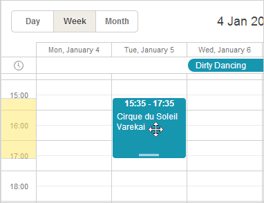
Highlights the event's duration on the time scale when you drag an event over the scheduler.
Type: boolean
Default value: true
Applicable views: day, week, units
DHXScheduler.Config.drag_lightbox
If the option is set to true then the lightbox can be dragged by the header.
Type: boolean
Default value: true
Applicable views: all views
DHXScheduler.Config.drag_move
Allows moving events by drag-and-drop.
Type: boolean
Default value: true
Applicable views: day, month, timeline, week, weekAgenda, units
DHXScheduler.Config.drag_resize
Allows resizing events by drag-and-drop.
Type: boolean
Default value: true
Applicable views: day, week, units
DHXScheduler.Config.edit_on_create
"Says" to open the lightbox on new event creation.
Type: boolean
Default value: true
Applicable views: all views
DHXScheduler.Config.isReadonly
Activates the read-only mode for events.
Type:boolean
Default value: false
Applicable views: all views
DHXScheduler.Config.key_nav
Disables the keyboard navigation in the scheduler.
Type: boolean
Default value: false
Applicable views: all views
DHXScheduler.Config.key_nav_step
Sets the time step (in minutes) for time selection in calendar area
Type: integer
Default value: 30
Applicable views: all views
DHXScheduler.Config.multisection
Enables the possibility to render the same events in several sections of the Timeline or Units view
Type: boolean
Default value: false
Applicable views: Timeline, Units
DHXScheduler.Config.multisection_shift_all
Specifies whether all instances ("true") or just the selected one ("false") should be dragged while dragging events assigned to several sections of the Timeline or Units view.
Type: boolean
Default value: true
Applicable views: Timeline, Units
DHXScheduler.Config.resize_month_events
Enables the possibility to resize single-day events in the Month view by drag-n-drop
Type: boolean
Default value: false
Applicable views: month
DHXScheduler.Config.resize_month_timed
Enables the possibility to resize single-day events in the Month view by drag-n-drop. Requires DHXScheduler.Config.resize_month_events to be enabled as well.
Type: boolean Default value: false Applicable views: month
DHXScheduler.Config.section_delimiter
Specifies the delimiter that will be used to separate several sections/units in the related data property of the event. By default, sections should be passed as comma-separated IDs.
Type: string
Default value: ","
Applicable views: Timeline, Units
DHXScheduler.Config.show_loading
"Says" to show a progress/spinner while data is loading (useful for dynamic loading).
Type: boolean
Default value: false
Applicable views: all views
DHXScheduler.Config.wai_aria_attributes
Adds WAI-ARIA attributes to scheduler markup
Type: boolean
Default value: true
Applicable views: all views
DHXScheduler.Config.wai_aria_application_role
Defines whether scheduler element and minicalendars should have "application" WAI-ARIA role.
Type: boolean
Default value: true
Applicable views: all views
Scales
- DHXScheduler.Config.first_hour
- DHXScheduler.Config.hour_size_px
- DHXScheduler.Config.last_hour
- DHXScheduler.Config.limit_time_select
- DHXScheduler.Config.mark_now
- DHXScheduler.Config.multi_day_height_limit
- DHXScheduler.Config.scroll_hour
- DHXScheduler.Config.start_on_monday
- DHXScheduler.Config.time_step
DHXScheduler.Config.first_hour
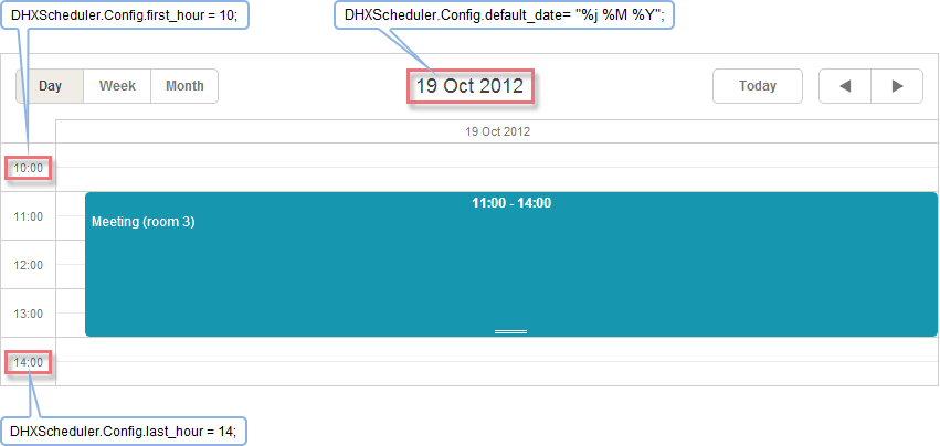
Sets the minimum value for the hour scale (Y-Axis). For more details, see the illustrative example.
Type: integer
Default value: 0
Applicable views: day, week, units
DHXScheduler.Config.hour_size_px
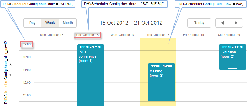
Sets the height of an hour in pixels. For more details, see the illustrative example
Type: integer
Default value: 42
Applicable views: day, week, units
DHXScheduler.Config.last_hour
Sets the maximum value of the hour scale (Y-Axis). For more details, see the illustrative example
Type: integer
Default value: 24
Applicable views: day, week, units
DHXScheduler.Config.limit_time_select
Sets the maximum and minimum values for the time selector in the lightbox to the values of the last_hour and first_hour options.
Type: boolean
Default value: false
Applicable views: all views
DHXScheduler.Config.multi_day_height_limit
Sets the maximum height of the multi-day section of the day/week view. If the required height exceeds the limit, vertical scroll appears
Type: Integer
Default value:
Applicable views: day, week, units
DHXScheduler.Config.scroll_hour
Sets the start value of the hour scale of a view (24-hour format).
Type: integer
Default value: 0 (i.e. the scale starts from the midnight - 00:00)
Applicable views: day, week, units
DHXScheduler.Config.start_on_monday
If the parameter is set to true, a week will start from Monday (otherwise, from Sunday).
Type: boolean
Default value: true
Applicable views: month, week, weekAgenda, year
DHXScheduler.Config.time_step
Sets the minimum step (in minutes) for the allowed event's start and end date values, i.e. if time_step=30, the event can start/end only at time multiple of 30 minutes: 8.00, 8.30, 9.00 and so on.
Type: integer
Default value: 5
Applicable views: all views
Date Formats
- DHXScheduler.Config.api_date
- DHXScheduler.Config.day_date
- DHXScheduler.Config.default_date
- DHXScheduler.Config.hour_date
- DHXScheduler.Config.month_date
- DHXScheduler.Config.month_day
- DHXScheduler.Config.week_date
- DHXScheduler.Config.xml_date
DHXScheduler.Config.api_date
Sets date format that will be used while specifying dates through API methods (format string variations). Used to parse incoming dates.
Type: string
Default value: "%d-%m-%Y %H:%i"
Applicable views: all views
DHXScheduler.Config.day_date
Sets the format for the date in the header of the week and units views (format string variations). For more details, see the illustrative example.
Type: string
Default value: "%D, %F %j"
Applicable views: week, units
DHXScheduler.Config.default_date
Sets the date format using by the templates day_date, week_date, day_scale_date for setting date in the headers of the day, timeline, week, weekAgenda and units views (format string variations). For more details, see the illustrative example.
Type: string
Default value: "%j %M %Y"
Applicable views: day, timeline, week, weekAgenda, units
DHXScheduler.Config.hour_date
Sets the format for Y-Axis items (format string variations). For more details, see the illustrative example.
Type: string
Default value: "%H:%i"
Applicable views: day, week, units
DHXScheduler.Config.month_date
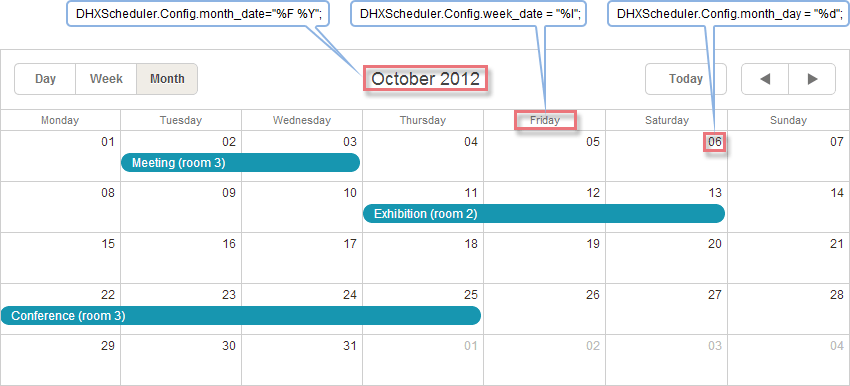
Sets the format for the header of the month view (format string variations). For more details, see the illustrative example.
Type: string
Default value: "%F %Y"
Applicable views: month
DHXScheduler.Config.month_day
Sets the format for the day in a cell of the month and year views (format string variations). For more details, see the illustrative example.
Type: string
Default value: "%d"
Applicable views: month, year
DHXScheduler.Config.week_date
Sets the format for the date in the sub-header of the month view (format string variations). For more details, see the illustrative example.
Type: string
Default value: "%l"
Applicable views: month
DHXScheduler.Config.xml_date
Sets the date format that is used while converting a string from an XML file into a date object (format string variations).
Type: string Default value: "%m/%d/%Y %H:%i" Applicable views: all views
Highlighting Events
- DHXScheduler.Config.displayed_event_color
- DHXScheduler.Config.displayed_event_text_color
- DHXScheduler.Config.highlight_displayed_event
DHXScheduler.Config.displayed_event_color
Sets the default background color for the events retrieved by the client-side showEvent() method. Used only in the showEvent() method context.
Type: string
Default value: "#ffc5ab"
Applicable views: all views
DHXScheduler.Config.displayed_event_text_color
Sets the default font color for the events retrieved by the client-side showEvent() method. Used only in the showEvent() method context.
Type: string
Default value: "#7e2727"
Applicable views: all views
DHXScheduler.Config.highlight_displayed_event
Specifies whether events retrieved by the client-side showEvent() method. Used only in the showEvent() method context.
Type: boolean
Default value: true
Applicable views: all views
Touch Support
- DHXScheduler.Config.touch
- DHXScheduler.Config.touch_drag
- DHXScheduler.Config.touch_invariant
- DHXScheduler.Config.touch_tip
- DHXScheduler.Config.touch_tooltip
DHXScheduler.Config.touch
Enables/disables the touch support in the scheduler. If touch is enabled, the scheduler tries to detect the touch device by analyzing the user-agent string of the browser. If a touch device is detected, it enables the touch support.
Type: boolean
Default value: true
Applicable views: all views
DHXScheduler.Config.touch_drag
Defines the time period that is used to differentiate the long touch gesture from the scroll gesture (in milliseconds). If you set the 0 value, the user won't be able to drag events.
Type: integer
Default value: 500
Applicable views: all views
DHXScheduler.Config.touch_invariant
Enables the persistent touch support, no matter what kind of device is used.
Type: boolean
Default value: false
Applicable views: all views
DHXScheduler.Config.touch_tip
Enables/disables prompting messages in the right up corner of the screen.
Type: boolean
Default value: true
Applicable views: all views
DHXScheduler.Config.touch_tooltip
Enables/disables dhtmxlScheduler tooltips on touch devices.
Type: boolean
Default value: true
Applicable views: all views
Blocking Events
- DHXScheduler.Config.check_limits
- DHXScheduler.Config.display_marked_timespans
- DHXScheduler.Config.limit_drag_out
- DHXScheduler.Config.limit_end
- DHXScheduler.Config.limit_start
- DHXScheduler.Config.limit_view
DHXScheduler.Config.check_limits
Activates/disables checking of limits. It makes sense to disable this option when you don't set any limits and just make some highlighting or mark the current time. It will increase the performance speed. But if you have some limit set, disabling this option will disable all the "blocking" methods.
Type: boolean
Default value: true
Applicable views: day, month, timeline, week, units
DHXScheduler.Config.display_marked_timespans
Defines whether the specified highlighted (marked) time spans should be displayed.
Type: boolean
Default value: true
Applicable views: day, month, timeline, week, units
DHXScheduler.Config.limit_drag_out
Denies to drag events out of the visible area of the scheduler
Type: boolean
Default value: false
Applicable views: Timeline
DHXScheduler.Config.limit_end
Sets the right border of the allowable date range.
Type: DateTime
Applicable views:day, month, timeline, week, units
DHXScheduler.Config.limit_start
Sets the left border of the allowable date range.
Type: DateTime
Applicable views:day, month, timeline, week, units
DHXScheduler.Config.limit_view
Limits viewing events. If we, for example, set a limit on the 2010 year we can't move to the 2009 year. Only 2010 and further
Type: boolean
Default value: false
Applicable views:day, month, timeline, week, units
Recurring Events
- DHXScheduler.Config.include_end_by
- DHXScheduler.Config.lightbox_recurring
- DHXScheduler.Config.occurrence_timestamp_in_utc
- DHXScheduler.Config.repeat_date
- DHXScheduler.Config.repeat_precise
DHXScheduler.Config.include_end_by
Defines whether the date specified in the "End by" field should be exclusive or inclusive. By default, the date set in the "End by" field is exclusive.
Type: boolean
Default value: false
Applicable views: all views
DHXScheduler.Config.lightbox_recurring
Defines the lightbox behavior while opening in the edit mode. The available values are:
- Ask - before the lightbox is opened, a message box alerts and asks the user whether he will edit a certain instance or the entire recurring event.
- Instance - the lightbox opens straight for editing a certain instance of the event.
- Series - the lightbox opens straight for editing the entire recurring event.
Type: enum
Default value: "Ask"
Applicable views:all views
DHXScheduler.Config.occurrence_timestamp_in_utc
The property allows working with recurring events independently of time zones. If the option is enabled timestamps of events are stored as UNIX time.
Watch out! The option is intended for "newborn" schedulers and won't affect already running ones.
Type: boolean
Default value: false
Applicable views: all views
DHXScheduler.Config.repeat_date
Sets the date format for the "End_by" field in the "recurring" details form.
Type: string
Default value: "%m.%d.%Y"
Applicable views: all views
DHXScheduler.Config.repeat_precise
Prevents including past days to events with the "weekly" recurrence.
Type: boolean
Default value: false
Applicable views: all views
Selection Menus
DHXScheduler.Config.icons_edit
Stores a collection of icons visible in the side edit menu of the event box. For more details, see the illustrative example.
Type: DHTMLX.Scheduler.EventButtonList
Default value: EventButtonList{ EventButtonList.Save, EventButtonList.Cancel};
Applicable views: day, week, units
DHXScheduler.Config.icons_select
Stores a collection of icons visible in the side selection menu of the event box. For more details, see the illustrative example.
Type: DHTMLX.Scheduler.EventButtonList
Default value: EventButtonList{ EventButtonList.Details, EventButtonList.Edit, EventButtonList.Delete};
Applicable views: day, week, units
Other
- DHXScheduler.Config.active_link_view
- DHXScheduler.Config.all_timed
- DHXScheduler.Config.auto_end_date
- DHXScheduler.Config.buttons_left
- DHXScheduler.Config.buttons_right
- DHXScheduler.Config.cascade_event_count
- DHXScheduler.Config.cascade_event_display
- DHXScheduler.Config.cascade_event_margin
- DHXScheduler.Config.date_now
- DHXScheduler.Config.drag_in
- DHXScheduler.Config.drag_out
- DHXScheduler.Config.event_duration
- DHXScheduler.Config.fix_tab_position
- DHXScheduler.Config.full_day
- DHXScheduler.Config.map_infowindow_max_width
- DHXScheduler.Config.map_initial_zoom
- DHXScheduler.Config.map_resolve_event_location
- DHXScheduler.Config.map_resolve_user_location
- DHXScheduler.Config.map_type
- DHXScheduler.Config.map_zoom_after_resolve
- DHXScheduler.Config.mark_now
- DHXScheduler.Config.multi_day
- DHXScheduler.Config.min_grid_size
- DHXScheduler.Config.min_map_size
- DHXScheduler.Config.positive_closing
- DHXScheduler.Config.preserve_scroll
- DHXScheduler.Config.separate_short_events
- DHXScheduler.Config.server_utc
- DHXScheduler.Config.show_quick_info
- DHXScheduler.Config.timeline_swap_resize
- DHXScheduler.Config.update_render
- DHXScheduler.Config.use_select_menu_space
DHXScheduler.Config.active_link_view
"Says" to present the numbers of days in the Month view as clickable links that open the related day in the specified view
Type: string
Default value:"day"
Applicable views: week, month
DHXScheduler.Config.all_timed
"Says" to show multi-day events in the regular way (as one-day events are displayed).
Possible values are:
- Default - to show all multi-day events as lines in the upper part of the scheduler (the standard display mode for multi-day events).
- Short - to show only multi-day events that last less than 24 hours (starts one day and ends another) in the regular way.
- Multiday - all multi-day events in the regular way.
Type: enum
Default value: "Default"
Applicable views:day, week, units
DHXScheduler.Config.auto_end_date
If the option is set to true, when you change the start event time or date, the end event time and date will be changed automatically in order to make the event duration value equal to 60 minutes.
Type: boolean
Default value: false
Applicable views: all views
DHXScheduler.Config.buttons_left
Stores a collection of buttons resided in the left bottom corner of the lightbox (see details).
Type: DHTMLX.Scheduler.LightboxButtonList Default value: LightboxButtonList{ LightboxButtonList.Save, LightboxButtonList.Cancel}; Applicable views: all views
DHXScheduler.Config.buttons_right
Stores a collection of buttons resided in the right bottom corner of the lightbox (see details).
Type: DHTMLX.Scheduler.LightboxButtonList
Default value: LightboxButtonList{ LightboxButtonList.Delete};
Applicable views: all views
DHXScheduler.Config.cascade_event_count
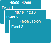
Sets the maximum number of events in a cascade. Events that 'exceed' the set value will be drown over the cascade. For more details, see the illustrative example.
Type: integer
Default value: 4
Applicable views: day, week, units
DHXScheduler.Config.cascade_event_display
By default, events scheduled to the same time are displayed one by one. If you want to present such events as a cascade, set the option to true. For more details, see the illustrative example.
Type: boolean
Default value: false
Applicable views: day, week, units
DHXScheduler.Config.cascade_event_margin
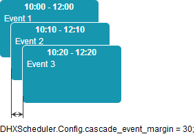
Sets the left margin for the cascade of events. For more details, see the illustrative example.
Type: integer
Default value: 30
Applicable views: day, week, units
DHXScheduler.Config.date_now
Moves the "mark_now" marker to the specified date. The option is available only if the DHXScheduler.Config.mark_now option is set to true.
Type: DateTime
Default value: the current date
Applicable views: day, week
DHXScheduler.Config.drag_in
Restricts dragging events to the calling scheduler from any other scheduler(s)
Type: boolean
Default value: true
Applicable views: day, week, units
DHXScheduler.Config.drag_out
Restrict dragging events from the calling scheduler to any other scheduler(s)
Type: boolean
Default value: true
Applicable views: day, week, units
DHXScheduler.Config.event_duration
Sets the initial duration of an event in minutes.
Type: integer
Default value: 5
Applicable views: all views
DHXScheduler.Config.fix_tab_position
By default, the dhx_terrace skinned scheduler presents the views tabs on the left side. To place the tabs on the right side, set the option to false.
Type: boolean
Default value: true
Applicable views: day, week, units
DHXScheduler.Config.full_day
If the option is set to true, entry fields in the "Time period" section of the lightbox are blocked and the time period is set to a full day from 00.00 of the current cell date until 00.00 of the next day.
Type: boolean
Default value: false
Applicable views: all views
DHXScheduler.Config.map_infowindow_max_width
The maximum width of the Google Maps popup marker in the map view.
Type: integer
Default value: 300
Applicable views: map
DHXScheduler.Config.map_initial_zoom
Sets the initial zoom of Google Maps in the map view.
Type: integer Default value: 1 Applicable views: map
DHXScheduler.Config.map_resolve_event_location
If the locations of events have no latitude and longitude values in the database but this option is set to true, the coordinates will be defined automatically while event loading.
Type: boolean
Default value: true
Applicable views: map
DHXScheduler.Config.map_resolve_user_location
Some browsers open up the opportunity to determine your location. And if this option is set to true, such opportunity will be offered while map loading.
Type: boolean Default value: false Applicable views: map
DHXScheduler.Config.map_type
Sets the type of Google Maps in the map view.
Possible values:
- HYBRID - displays a transparent layer of major streets on satellite images.
- ROADMAP - displays a normal street map.
- SATELLITE - displays satellite images.
- TERRAIN - displays maps with physical features such as terrain and vegetation.
Type: enum
Default value: ROADMAP
Applicable views: map
DHXScheduler.Config.map_zoom_after_resolve
Sets the zoom that will be used to show your location if you agree to a browser offer to show it.
Type: integer
Default value: 15
Applicable views: map
DHXScheduler.Config.mark_now
If the option is set to true then the day and week views will have marker displaying the current time. For more details, see the illustrative example.
Type: boolean
Default value: false
Applicable views: day, week
DHXScheduler.Config.multi_day
Enables rendering multi-day events.
Type: boolean
Default value: false
Applicable views: day, week, units
DHXScheduler.Config.min_grid_size
Minimal height of grid view that can be set by ContainerAutosize extension.
Type: integer
Default value: 25
Applicable views: grid
DHXScheduler.Config.min_map_size
Minimal height of map view that can be set by ContainerAutosize extension.
Type: integer
Default value: 400
Applicable views: map
DHXScheduler.Config.positive_closing
A click on the button  opens the edit form for editing text of the event.
Any outside click closes the form and cancels your changes. To prevent this and save any changes made in the form, set the option to true.
Type: boolean
Default value: false
Applicable views: day, week, units
DHXScheduler.Config.preserve_scroll
If the option is set to true, the current scroll position is preserved while navigating between dates of the same view
(through this panel -  ).
).
Type: boolean
Default value: true
Applicable views: day, week, units
DHXScheduler.Config.separate_short_events
Allows you to prevent short events from overlapping. For more details, see the illustrative example.
Type: boolean
Default value: false
Applicable views: day, week, units
DHXScheduler.Config.server_utc
If the option is set to true, server-side dates will be converted from UTC to a local time zone and backward while sending data to the server.
Type: boolean
Default value: false
Applicable views: all views
DHXScheduler.Config.timeline_swap_resize
Defines that during event resizing the end date of the event can be swapped for the start date (after the end date becomes scheduled before the start one)
Type: boolean
Default value: true
Applicable views: timeline
DHXScheduler.Config.update_render
If the option is set to true, each time when an event is updated, the whole view will be refreshed (not only the changed event). It smoothes size re-calculation, but results in higher CPU usage.
Type: boolean
Default value: false
Applicable views: all views
DHXScheduler.Config.use_select_menu_space
By default, an event occupies just a part of the cell width and leaves the place for the left-side menu. Set the option to true and events will start to occupy the whole width.
Type: boolean
Default value: false
Applicable views: day, week, units
Illustrative Examples
Cascade Mode
- default mode

- cascade mode
Cascade Event Margin
Day View
Week View
Month View
Event box

Separating short events
