Date Picker (Mini Calendar)
MiniCalendar provides the ability to render a small month view in any HTML container on a page.
MiniCalendar can be put into 3 places (each place 'requires' its specific code): in the scheduler header, in the lightbox, or in an HTML container outside the scheduler.
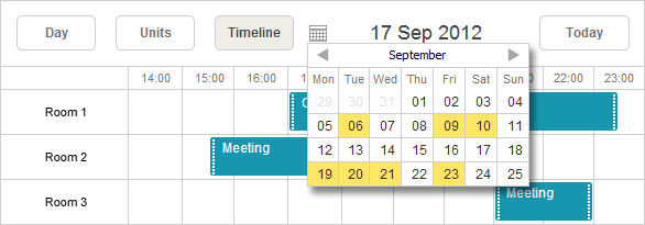
Mini Calendar in the Header
You can place the mini calendar into the header of scheduler.

To add mini calendar to the header, call the method AttachMiniCalendar():
var sched = new DHXScheduler(this);
...
sched.Calendars.AttachMiniCalendar();
The method returns a miniCalendar object that can be used for further calendar configuration.
var cal = sched.Calendars.AttachMiniCalendar();
cal.Navigation = true;
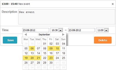
Mini Calendar in the Lightbox
The mini calendar can be used in the lightbox for "start" and "end" dates selection.

To use the mini calendar in the details form, just add the appropriate control - LightboxMiniCalendar:
var sched = new DHXScheduler(this);
...
sched.Lightbox.Add(new LightboxMiniCalendar("name", "label"));
Mini Calendar Outside Scheduler
The mini calendar can be placed in any place of the page outside the scheduler.

Use the code below to put the mini calendar in an outer HTML container:
var sched = new DHXScheduler(this);
...

var cal = new MiniCalendar("container_id"); // initialization
cal.Navigation = true; // configuration
sched.Calendars.Add(cal); // adding to the page
Note, the container for the mini calendar can be specified in 2 ways:
1 . Directly in the constructor (as in the above example);
2 . After initialization (through the Container property):
var cal = new MiniCalendar();
cal.Container = "container_id";
sched.Calendars.Add(cal);
Properties
- Container - (string) the id of a DOM element where the mini calendar will be placed.
- Date - (DateTime) the initially selected date.
- Handler - (js function) the handler function of the 'onDateSelect' event that is called when the user makes an explicit date selection using the mouse.
- IsAttachedToHeader - (boolean) checks whether the mini calendar is attached to the scheduler or another DOM element.
- Navigation - (boolean) allows mouse scrolling.
- Position - (string) the css class name of the element which the mini calendar will be attached to. The property is used to set the position of the calendar in the scheduler. Specify the desired html element through its css class and anytime you click on this element, the mini calendar will appear.