Displaying Images in Calendar Agenda/Day View
To make your calendar events more informative and visually attractive, you can insert pictures or images directly into the event boxes. It's especially helpful, if you create an events calendar for theater performances, exhibitions announcements or similar events. You can also use this template to cover your office needs by adding employees' photos to scheduled appointments.
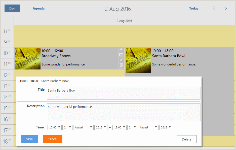
This template also demonstrates how you can customize the time scale and event boxes to make your events calendar look great, like in this demo:
To explain how this demo was created, we have created a guide that explains the implementation of the above-mentioned functionality step-by-step.
So, let's start from the very beginning.
Making Preparations
Install DHTMLX Scheduler .NET, if you still haven't. The latest .NET MVC Sample of Scheduler .NET is available on NuGet.
Instructions on how to set up a calendar app in .NET MVC can be found here.
When you are done, get down to the customization magic:
1. Adding Day and Agenda Views
For this template we will create two views: a Day view and an Agenda view. Day View will help you plan and display your events for a particular day. Agenda View will show the forthcoming events in the timeline.
Remove the default views and add the required ones (in C#) as it is shown below:
scheduler.Views.Clear();
scheduler.Views.Add(new DayView());
scheduler.Views.Add(new AgendaView());
scheduler.InitialView = (new AgendaView()).Name;
Let's fix the location of switch buttons (Agenda, Day) in the calendar via the CSS code below:
.dhx_cal_navline .dhx_cal_tab_standalone {
    left:115px!important;
}
When we move the 'Agenda' button, its place in the mobile display changes too. So, we have to fix it:
@media screen and (max-width: 767px) {
    .dhx_cal_navline .dhx_cal_tab{
        left:auto !important;
    }
}
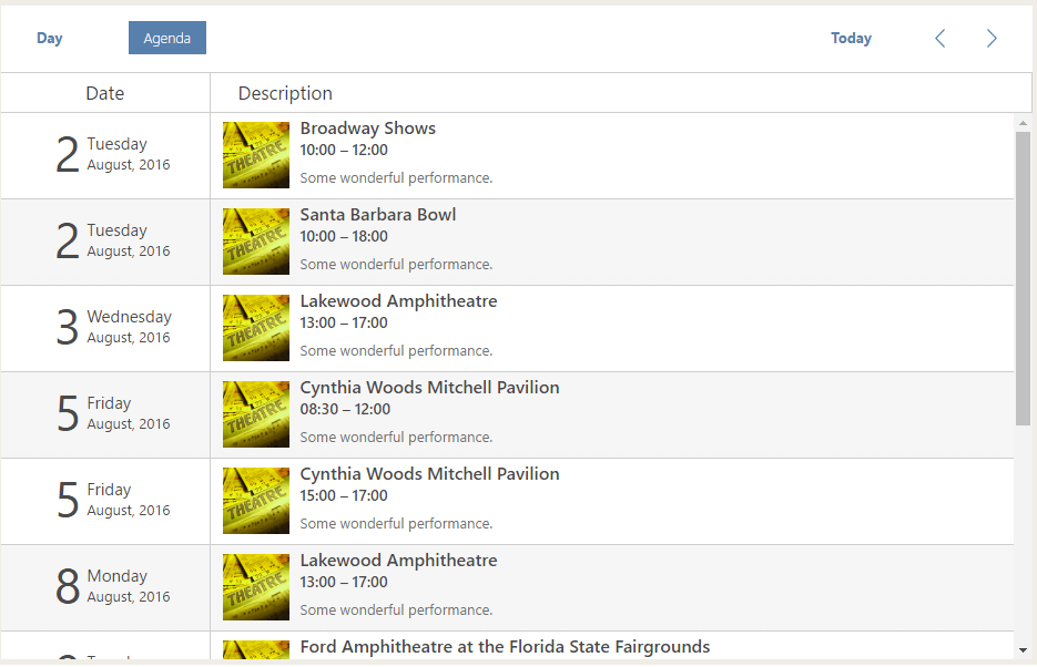
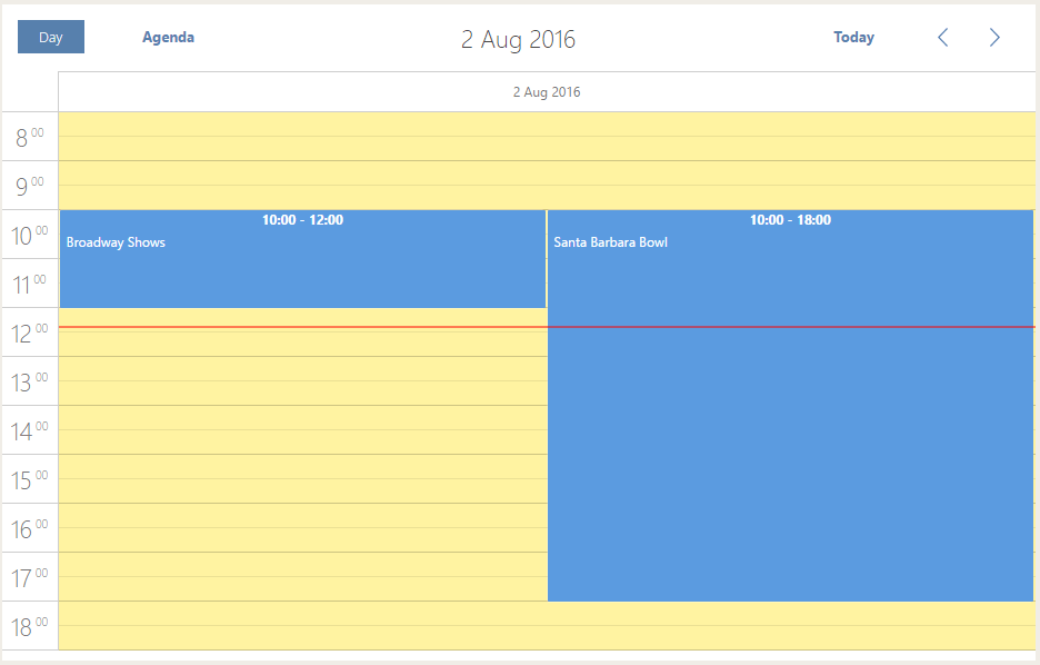
Once the code is added, we get the following views:
Agenda View
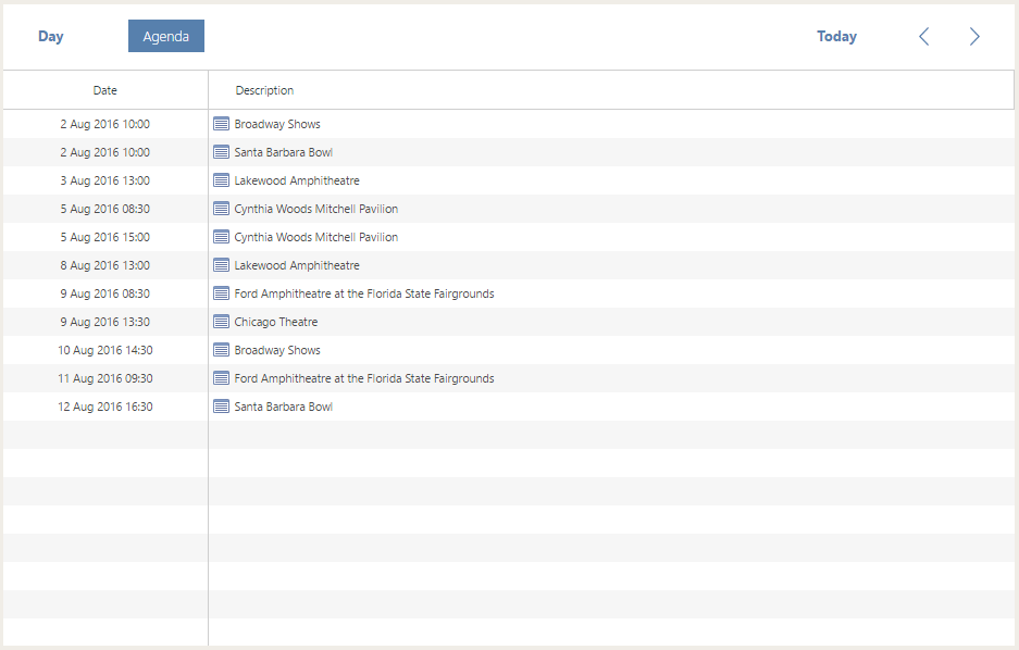
Day View
2. Creating Custom Event Box (Day View)
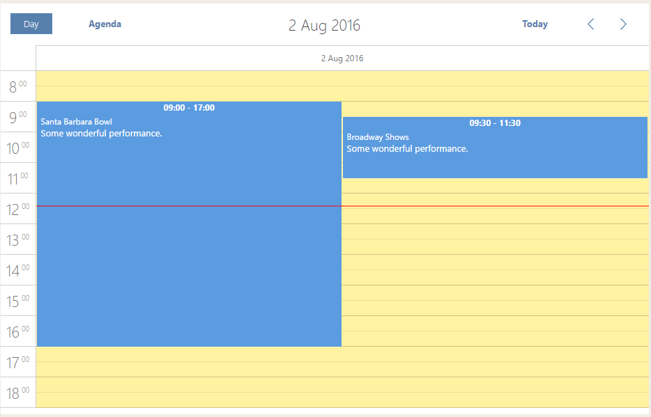
Everyone knows how a poster or an events guide looks like. It contains a picture, date and time, and some eye-catching information about the upcoming event. The default version is not enough to meet our needs, so we will customize the event box, as follows:
- add a new description field (that's where you can enter additional information about the event).
To display this field, let's add the following JS code that will be responsible for the information in the box:
scheduler.templates.event_text = function (start, end, ev) {
    var box = "<div class='event_text'> <div>" + ev.text + "</div><div style='font-size:13px !important;'>" +
        ev.description + "</div></div>";
    return box;
}
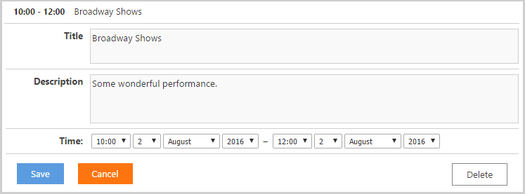
- add a new section Description to the details form (or lightbox) to edit the additional information (C#):
var description = new LightboxText("description", "Description");
description.Height = 70;
scheduler.Lightbox.Add(description);
- move the Time section in the details form to the left and fix it for proper display on mobile devices:
@media screen and (max-width: 767px) {
     .dhx_section_time{
          margin-left:0px !important;
     }
}

.dhx_section_time{
     margin-left:-100px;
}
Done. Now it looks exactly as we've expected.
Let's open the day view.
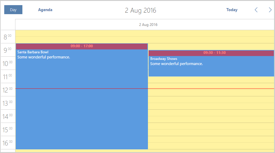
- remove the title row (highlighted in red on the screenshot) so the content would start from the top of the event box.
Unfortunately, it can't be done via templates, and hiding that row via CSS will affect the displayed height of an event. So, we'll have to create event HTML by hand, using the scheduler.renderEvent method.
Let's configure our own event box (JS):
scheduler.templates.event_class = function (start, end, event) {
return "my_event";
};
Â
scheduler.renderEvent = function (container, ev) {
var container_width = container.style.width;
var html = "<div class='dhx_event_move my_event_move' style='width: " + container_width + "'></div>";
html += "<div class='my_event_body'>";
html += scheduler.templates.event_text(ev.start_date, ev.end_date, ev);
html += "</div><div class='dhx_event_resize my_event_resize' style='width: " + container_width + "'></div>";
container.innerHTML = html;
return true;
};
and add CSS styles:
.dhx_cal_event.my_event{
     background-color: lightgray;
     overflow: hidden;
}

.dhx_cal_select_menu.my_event div {
     border: 0;
     background-color: transparent;
     color: black;
}

.dhx_cal_event.my_event .my_event_body {
     padding-top: 3px;
     padding-left: 5px;
     color:black;
     font-size:15px;
}

.my_event_move {
     position: absolute;
     height: 20px;
     cursor: pointer;
}

.my_event_resize {
     height: 5px;
     position: absolute;
     bottom: -1px;
}

.my_event:hover .my_event_resize{
     background:url(Scripts/dhtmlxScheduler/imgs_flat/resizing.png) center center no-repeat;
}

.dhx_cal_select_menu .dhx_event_move{
     position:relative;
     top:3px;
}
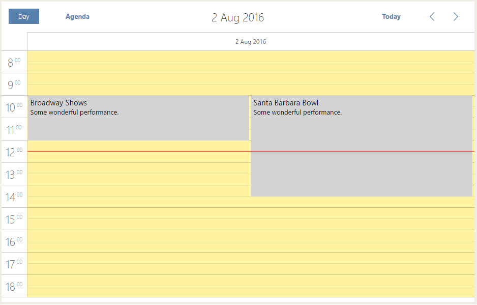
Wonderful. As far as we've created our own box, we have to fix the displayed data in it.
Let's make amendments in the function we have added earlier. This function is responsible for data displayed in the event box. We'll add a field for an image and the time of event:
scheduler.templates.event_text = function (start, end, ev) {
    var box = "<div class='event_picture'></div> <div class='event_text'> <div style= 'font-weight:600;'>" +
      scheduler.templates.event_header(start, end, ev) + "</div> <div style='padding-bottom:15px; font-weight:600;'>" +
        ev.text + "</div><div style='font-size:13px !important;'>" + ev.description + "</div></div>";
    return box;
}
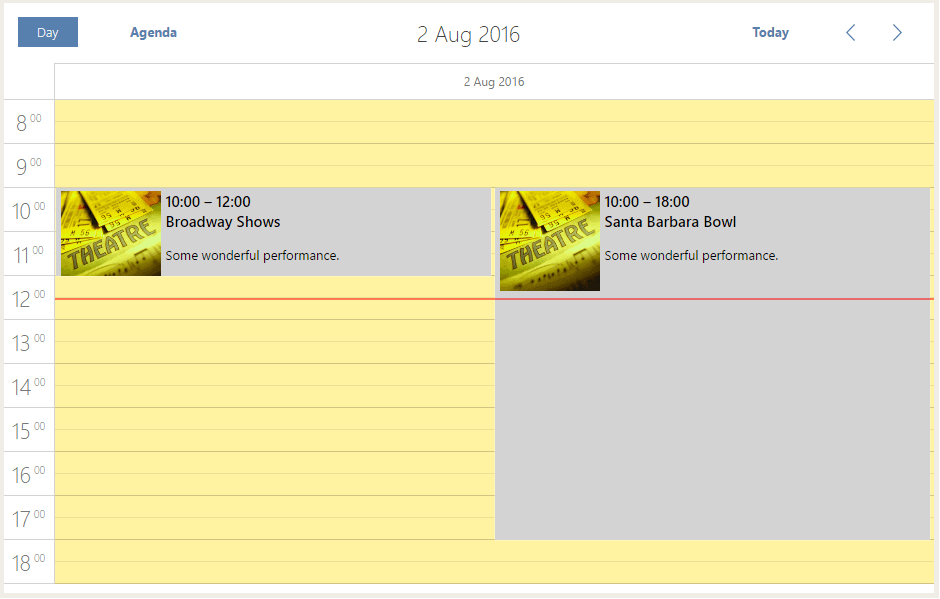
Some styles are added during the construction of HTML code. It should be noted, that we added a < div > element with the event_picture class. It helps to insert a picture into the event using CSS:
.event_picture{
     background-image:url(/image/theatre.jpg);
     background-size:cover;
     height:100px;
     width:100px;
     float:left;
     margin-right:5px;
}
3. Configuring Agenda View
Let's increase the height of an event to have enough space for input data (event details and image) later (CSS):
.dhx_cal_header .dhx_agenda_line{
     font-size:17px !important;
}

.dhx_agenda_line .icon_details{
     display:none;
}

.dhx_agenda_area,
.dhx_scheduler_agenda .dhx_cal_data{
     background-size:3px;
}

.dhx_agenda_area .dhx_agenda_line{
     height:71px !important;
     margin-top:6px;
     border-bottom: 1px solid #CECECE;
}
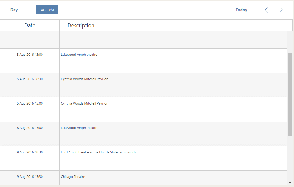
Our Agenda View is divided into two columns: the "Day" column and the "Description" column. Let's set up them one after another. The "Day" column will go first.
We will add two auxiliary functions that will display the names of the day of a week or a month. To implement them, we'll use the built-in functions of scheduler (JS):
var formatMonth = scheduler.date.date_to_str("%F, %Y");
var formatWeekDay = scheduler.date.date_to_str("%l");
Afterwards, we will add a function to form text in the Day field (JS):
scheduler.templates.agenda_time = function (start, end, ev) {
    var text_date = "<div class='agenda_date'><div class='agenda_date_day'>" + start.getDate() +
       "</div><div class='agenda_date_desc'> <div class='agenda_date_weekday'>" + formatWeekDay(start) +
         "</div> <div class='agenda_date_month'>" + formatMonth(start) + "</div></div></div>";
    return text_date;
};
Then we will apply the following styles to the described classes:
.agenda_date{
     margin-top:3px;
}

.agenda_date div {
     float:none !important;
}

.agenda_date_day{
     width:30% !important;
     display:inline-block;
     font-size:45px;
     line-height:50px!important;
     text-align:right !important;
}

.agenda_date_desc{
     width:50% !important;
     display:inline-block;
     margin-left:5px !important;
}

.agenda_date_weekday{
     text-align:left !important;
     line-height:12px!important;
     font-size:15px;
     overflow:visible !important;
}

.agenda_date_month{
     text-align:left !important;
     font-size:13px;
}
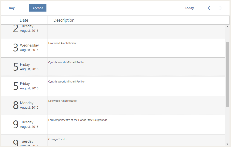
Looks nice. Let's go ahead with the "Description" column (JS):
scheduler.templates.agenda_text = function (start, end, ev) {
    var agenda_text = "<div class='agenda_description'> <div class=€"box_for_picture"€™><div class='event_picture'></div></div>" +
         "<div class='agenda_description_desc'> <div class='agenda_description_title'>" + ev.text +
         "</div><div class='agenda_description_time'>" + scheduler.templates.event_header(start, end, ev) +
         "</div> <div class='agenda_event_description'>" + ev.description + "</div></div></div>";
     return agenda_text;
};
Finally, we'll apply styles to the described classes to beautify the display of information:
.dhx_agenda_line .event_picture{
     width:60px;
     height:60px;
     display:inline-block;
}

.box_for_picture {
     width: 60px !important;
     display: inline-block;
     text-align: left;
     margin-right: 10px;
     margin-top: 2px;
}

.agenda_description{
     width:100% !important;
     margin-left:200px;
     margin-top:-65px;
     text-align:left !important;
}

.agenda_description div{
     float:none !important;
     line-height:20px !important;
}

.agenda_description_desc{
     width:60% !important;
     display:inline-block;
     text-align:left !important;
     height: 71px !important;
}

.agenda_description_title{
     width:95% !important;
     text-align:left !important;
     font-size:16px !important;
     font-weight:600;
     white-space:nowrap;
     text-overflow:ellipsis;
}

.agenda_description_time{
     text-align:left !important;
     font-size:14px !important;
     font-weight:600;
}

.agenda_event_description{
     width:95% !important;
     text-align:left !important;
     font-size:13px !important;
     white-space:nowrap;
     text-overflow:ellipsis;
     margin-top:5px;
     color: #707070 ;
}

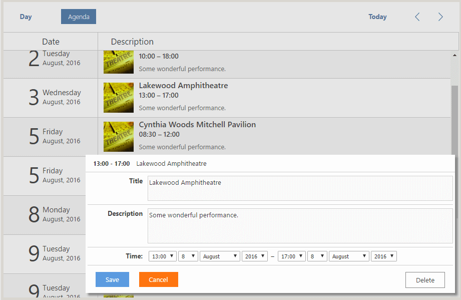
Done! Now it looks perfect, right? The result demonstrates that you can customize Scheduler .NET the way you wish.
Agenda View
Day View
