Lightbox

In this chapter you'll know how to:
How to add a control to the lightbox

Generally, to add a control to the lightbox you should use method Add():
scheduler.Lightbox.Add(LightboxItem object);
Namespace Controls contains controls available for adding.
The main members of the namespace are:
- LightboxMiniCalendar - a date input with popup calendar;
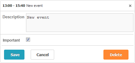
- LightboxCheckbox - a check box;
- LightboxMultiselect - a multi-select list box;
- LightboxSelectOption - a select option of the list box.
- LightboxRadio - a set of radio buttons;
- LightboxSelectOption - a single radio button.
- LightboxSelect - a dropdown list;
- LightboxSelectOption - a select option of the dropdown list.
- LightboxText - a text input;
- LightboxTime - a control area containing 2 date inputs for setting start and end times;
- LightboxReccuringBlock - a control area used to set values for reccuring events.
var check = new LightboxCheckbox("highlighting", "Important");
check.MapTo = "textColor";
check.CheckedValue = "red";

scheduler.Lightbox.Add(check);
scheduler.Lightbox.Add(new LightboxText("text", "Description"));
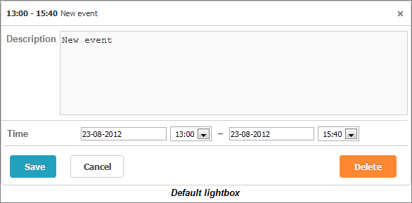
By default, the scheduler contains 2 controls:
- time - (LightboxTime) the start (when an event is scheduled to begin) and end (when an event is scheduler to be completed) times.
- text - (LightboxText) the text of an event.
Beware, as soon as you add some custom control, the default controls will be removed. To add some new control and hold the default ones, add the following code to the action:
scheduler.Lightbox.AddDefaults();
Dropdown controls
Here is a common technique for adding select(multiselect, radio) controls to the lightbox:
- Instantiate a control;
- Populate it with data (method AddOptions());
- Add it to the lightbox (method Add()).
var select = new LightboxSelect("textColor", "Priority");
var items = new List<object>(){
                new { key = "gray", label = "Low" },
                new { key = "blue", label = "Medium" },
                new { key = "red", label = "High" }
};
select.AddOptions(items);
scheduler.Lightbox.Add(select);
Note, to be correctly processed data items for the controls should have the properties key (the id of an option) and label ( the text label of an option).
.Net form as a lightbox

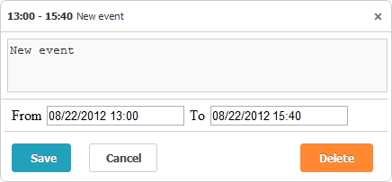
The advantage of the native .NET form is that you can fully configure its logic on the server-side. Commonly, all you need to do is to load the form into a view and set this view for the lightbox.
So, to use .Net form as a lightbox you should do the following:
View:
Controller:
- Set the partial view as a lightbox (in the SetExternalLightbox() method you should specify the newly added action that will return the desired view);
View:
1. .Net form definition
<%@ Control Language="C#" Inherits="System.Web.Mvc.ViewUserControl<SchedulerTest.Models.Event>" %>
<!--LightboxControl.ascx-->
<!DOCTYPE html />
<html>
<body>
  <% Html.BeginForm("Save", "MVCFormInLightbox"); %>
    <div>
      <%= Html.TextArea("text", Model.text, 5, 42, null)%>
      </div>
      <%= Html.Hidden("id", Model.id)%>
      <div>
        From
        <%= Html.TextBox("start_date", Model.start_date, new { @readonly = "readonly" })%>
        To
        <%= Html.TextBox("end_date", Model.end_date, new { @readonly = "readonly" })%>
      </div>
      <%= Html.Hidden("user_id", Model.user_id)%>
      <p>
        <input type="submit" name="actionButton" value="Save" />
        <input type="button" onclick="lightbox.close()/* helper-method, only available in custom lightbox */" value="Close" />
        <input type="submit" name="actionButton" value="Delete" />
      </p>
  <% Html.EndForm(); %>
</body>
</html>
Controller:
1. Partial view with .Net form
//LightboxControl.cs
public ActionResult LightboxControl(int id) {
      var context = new DHXSchedulerDataContext();
      var current = context.Events.SingleOrDefault(e => e.id == id);
      return View(current);
}
2. Setting .Net form as a lightbox
//LightboxControl.cs
public ActionResult Index() {
      scheduler = new DHXScheduler(this);
      ...
      var box = scheduler.Lightbox.SetExternalLightbox("MVCFormInLightbox/LightboxControl", 420, 195);
      box.ClassName = "custom_lightbox";// if you want to apply your custom style
      return View(scheduler);
}
Method SetExternalLightbox() returns an ExternalLightboxForm object, with the following public properties:
- Width - (integer) the width of the lightbox;
- Height - (integer) the height of the lightbox;
- ClassName - (string) the css class that will be applied to the lightbox;
- View - (string) the path to a view that you want to load.
3. CRUD logic
//LightboxControl.cs
public ActionResult Save(Event changedEvent, FormCollection actionValues)
{
        var action = new DataAction(actionValues);
        if (action.Type != DataActionTypes.Error)
        {
            return NativeSave(changedEvent, actionValues);//where NativeSave is the default save action for updates which can be performed without using lightbox(e.g. d'n'd)
        }

//Implementation create/update/delete operations.
//Note, we use try-catch block to handle exceptions which may be thrown during operations. In this case, we must assign the error status to a DataAction object
//in order to mark the appropriate action on the client-side as failed.

        action = new DataAction(DataActionTypes.Update, changedEvent.id, changedEvent.id);
        if (actionValues["actionButton"] != null)
        {
           DHXSchedulerDataContext data = new DHXSchedulerDataContext();
           try
           {
             if (actionValues["actionButton"] == "Save")
             {
                   if (data.Events.SingleOrDefault(ev => ev.id == action.SourceId) != null)
                   {
                        changedEvent = data.Events.SingleOrDefault(ev => ev.id == action.SourceId);
                        TryUpdateModel(changedEvent);
                   }
                   else
                   {
                        action.Type = DataActionTypes.Insert;
                        data.Events.InsertOnSubmit(changedEvent);
                   }
             }else if(actionValues["actionButton"] == "Delete"){
                   action.Type = DataActionTypes.Delete;
                   changedEvent = data.Events.SingleOrDefault(ev => ev.id == action.SourceId);
                   data.Events.DeleteOnSubmit(changedEvent);
             }
             data.SubmitChanges();
           }

           catch (Exception e)
           {
              action.Type = DataActionTypes.Error;
           }
        }
        else
        {
           action.Type = DataActionTypes.Error;
        }
        return (new SchedulerFormResponseScript(action, changedEvent));
}
comments powered by Disqus
