In this tutorial we’d like to demonstrate how you can quickly and effortlessly customize appointments in your calendar using Scheduler .NET control. The adding of a checkbox to each event and the possibility to assign events to different resources will transform your scheduler into a simple task assignment app in ASP.NET.
First of all, if you haven’t tried DHTMLX Scheduler .NET, download it. Alternatively, you can install it directly from NuGet. The recent updated instructions on how to set up a calendar app in ASP.NET MVC can be found here.
Once you are done, proceed with additional functionality, which implementation is described below. In the end, you’ll get a ready-to-use calendar with checkboxed events, distinguished by assignees. Check out this live demo:
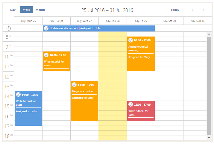
Let’s implement the described above features step-by-step.
1. Adding Users to Calendar
Let’s assign a user to each appointment. For this demo we'll use static users we've defined in the code.We'll add them to scheduler data response using ServerList collection (C#):
var data = new SchedulerAjaxData();
...
data.ServerList.Add("users", new List <object> {
    new { key = 1, label = "John"},
    new { key = 2, label = "Mary"},
    new { key = 3, label = "Tom"}
});
Additionally, you have to add a property user_id to the data model.
In order to switch appointments between users from the UI we'll need a select control, Let's add it into the details form (lightbox).
Add the following lines to DHXScheduler configuration (C#):
var select = new LightboxSelect("user_id", "User");
select.ServerList = "users";
scheduler.Lightbox.Add(select);

Note that instead of populating a control with options right away we've linked it to the ServerList that we've added to the data feed.
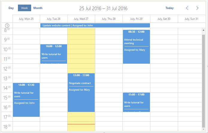
Now every created task is assigned to a user. To show the assignee of a task,
let’s set up the displayed text on the event using the js code.
To display the assignee’s name after the task name and format the task view accordingly, add the following code (JS):
scheduler.templates.event_text = function(start, end, ev) {
    var users = scheduler.serverList("users");
    var box = "</br>" + ev.text + "<hr /> Assigned to: ";
    for (var i = 0; i < users.length; i++) {
        if (users[i].key == ev.user_id) {
            box += users[i].label;
        }
    }
    return box;
}

scheduler.templates.event_bar_text = function(start, end, ev) {
    var users = scheduler.serverList("users");
    var box = ev.text + " | Assigned to: ";
    for (var i = 0; i < users.length; i++) {
        if (users[i].key == ev.user_id) {
            box += users[i].label;
        }
    }
    return box;
}
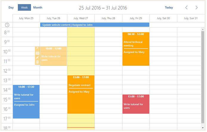
As a result, we get the following page view:
2. Diversifing user colors
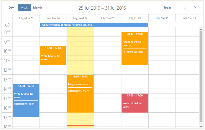
Now you have to set color for each assignee to distinguish the appointments. Define CSS class for each appointment depending on the user:
scheduler.templates.event_class = function(start, end, ev) {
    return "user_" + ev.user_id;
};
In this case you have to use such styles as “user_1”, “user_2” and “user_3”. Each of them should have a separate CSS style. User_1 will have a standard style by default.
.dhx_cal_event.user_2 div,
.dhx_cal_event_line.user_2 {
    background-color: orange !important;
}
.dhx_cal_event_clear.user_2 {
    color: orange !important;
}
.dhx_cal_event.user_3 div,
.dhx_cal_event_line.user_3 {
    background-color: #E05B63 !important;
}
.dhx_cal_event_clear.user_3 {
    color: #E05B63 !important;
}
.dhx_body hr {
    border: none;
    background-color: white;
    height: 2px;
}
Done. Your multi-colored calendar is ready:
3. Adding CheckBox to Details Form
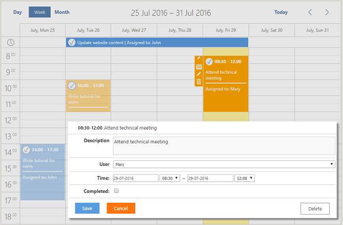
Let’s set up a checkbox to show if a task is completed or not. When the event is marked as completed, the event color and the checkbox will turn pale.
First of all, let’s add a checkbox. To display it in the event, add the following line to the code (C#):
scheduler.Lightbox.Add(new LightboxCheckbox("completed", "Completed:"));
“scheduler” - the instance of DHXScheduler class.
"completed" - the name of the control which can be used to access it from the client side API, and also the name of the property of the appointment object which will be bind to this control. You have to add 'completed' property to the Appontment/Event model class
"Completed:" - that’s how the inscription in the details form (lightbox) will look like.
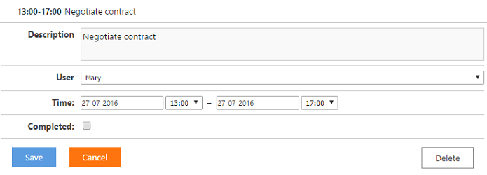
Now we want completed tasks to be visually different from ones still in progress. In order to do so we define a css class with necessary styles and assign this class to completed events from event_class template
CSS code:
.scheduler_event_completed {
    opacity: 0.45;
}
JS code:
scheduler.templates.event_class = function(start, end, ev) {
    var event_class = "user_" + ev.user_id;
    if (ev.completed) {
        event_class += " scheduler_event_completed";
    }
    return event_class;
};
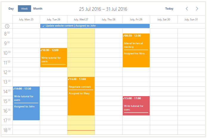
It is not very user-friendly to open a lightbox each time you need to change task status. Let’s display a checkbox directly in the event.
So what we're going to do is to implement a styled checkbox and insert it into the header of single day events and into the main content of multi-day events. Here is a function that will create a markup for the checkbox (JS):
function create_checkbox(ev) {
    var checkbox = "<input class='new_checkbox' type='checkbox' id='check" + ev.id + "' name='check' ";
    if (ev.completed) {
        checkbox += "checked ";
    }
    checkbox += "><label class='new_label' for='check" + ev.id + "'><span>✓</span></label>"
    return checkbox;
}
Now, insert the checkbox into the header of single-day events (JS):
scheduler.templates.event_header = function(start, end, ev) {
    var box = "<div style='white-space:nowrap;overflow:hidden;'> + create_checkbox(ev);
    box += scheduler.templates.event_date(start) + " - " + scheduler.templates.event_date(end) + "</div>"
    return box;
}
And into the body of multi-day events (JS):
scheduler.templates.event_bar_text = function(start, end, ev) {
    var box = create_checkbox(ev);
    box += < span style = 'position:relative;top:-2px;margin-left:2px;' > " + ev.text + " | Assigned to: ";
    for (var i = 0; i < users.length; i++) {
        if (users[i].key == ev.user_id) {
            box += users[i].label + "</span>";
        }
    }
    return box;
}
Since the lightbox header inherits event_header template, after you do changes described above a checkbox will appear in lightbox header, which we don't want. We'll need to redefine lightbox header in order to rid off of it (JS):
scheduler.templates.lightbox_header = function(start, end, ev) {
    var text_header = "<span class='dhx_time' style='padding-right:5px;'>" + scheduler.templates.event_date(start) + "-" +
        scheduler.templates.event_date(end) + "</span> ";
    text_header += " " + ev.text;
    return text_header;
};
In order to bind changes of a checkbox state to the appointment model we'll use event delegation approach - capture global event click, and if we detect that click was triggered on a checkbox element - toggle the related property of an appointment.
Write the following code (JS):
scheduler.attachEvent("onClick", function(id, e) {
    if (e.target.name == "check" && e.target.type == "checkbox") {
        var event = scheduler.getEvent(id);
        event.completed = !event.completed;
        scheduler.updateEvent(id);
        return;
    }
    return true;
});
Let’s add classes new_checkbox for checkblox and new_lable for label that will replace the default rectangular checkbox.
Update formating using CSS:
.dhx_title {
    overflow: visible !important;
    text-align: left !important;
}
.dhx_footer {
    height: 10px !important;
    margin-top: -10px !important;
}
.dhx_cal_event_clear {
    height: 27px !important;
}
.dhx_cal_wide_checkbox input {
    display: block !important;
    margin-top: 5px !important;
    vertical-align: text-top;
    width: 40px;
}
.new_checkbox {
    display: none;
}
Let’s add our own checkbox styles. You can customize checkbox border color, border style and css class the way you like:
.new_label {
    display: inline-block;
    width: 20px;
    height: 20px;
    border-radius: 50%;
    background: #F5F5F5;
    cursor: pointer;
    margin: 5px 5px 8px;
    vertical-align: middle;
    color: #5780AD;
    text-align: center;
    font-size: 17px;
}
.new_label:hover,
.new_checkbox:checked + .new_label {
    border: 2px solid #5780AD;
    margin: 3px 3px 6px;
}
.dhx_cal_event_line {
    height: 24px !important;
}
.dhx_cal_event_line .new_label {
    vertical-align: bottom;
    margin: 0px;
    margin-top: 2px;
    margin-left: -5px;
}
.dhx_cal_event_line .new_label:hover,
.dhx_cal_event_line .new_checkbox:checked + .new_label {
    margin: -2px !important;
    margin-top: 0px !important;
    margin-left: -7px !important;
}
.new_label span {
    position: absolute;
    top: 4px;
    left: 9.5px;
    opacity: 0.5;
    font-weight: bolder;
}
.dhx_cal_event_clear .new_label span {
    position: relative;
    left: 0px;
}
.new_label:hover span,
.new_checkbox:checked + .new_label span {
    opacity: 1;
}
.dhx_cal_event_line .new_label span {
    left: 8.5px !important;
}
.dhx_cal_event_clear>span {
    top: 0px!important;
    margin-left: -2px!important;
}
Next, increase the height of multi-day appointments (JS):
scheduler.xy.bar_height = 30;
Open the Month view. You can see that the task slot is overloaded with excess elements, which doesn’t look good:

Let’s fix it and remove appoinment time displayed by default:
scheduler.templates.event_bar_date = function (start, end, ev) {
return "";
};

That’s all. The calendar is customized and ready for use.
Start building your beautiful web calendar app now. Get DHTMLX Scheduler .NET :

Do you have any questions regarding this tutorial? Feel free to ask.